Jägermeister: MeisterHaus Re-Brand
MeisterHaus:
(noun) [mai-stuh-haus]
A house-like installation at festivals. Home to music, bars and the infamous HausCat. The MeisterHaus is known as a great place to meet up with fellow meisters and enjoy the resident DJ’s haus tracks while drinking ice cold shots.
The Brief:
Jagermeister requested a new logo, as well as a new interior style for their MeisterHaus. The logo needed to be unique and take inspiration from the two art styles; Baroque and Bauhaus. The logo needed to work within the existing Jagermeister Brand yet still be original to ensure it stands out when representing the Meister Haus experience. The logo had to be easily unpacked into a visual identity.
The Solution:
The request of two vastly different art styles required a unique solution resulting in a Bauhaus inspired logo and unique Baroque MeisterHaus interior furnishings. This allowed for a look and feel that disrupted the norm and echoed the unique style of attendees who frequent the Haus at festivals.

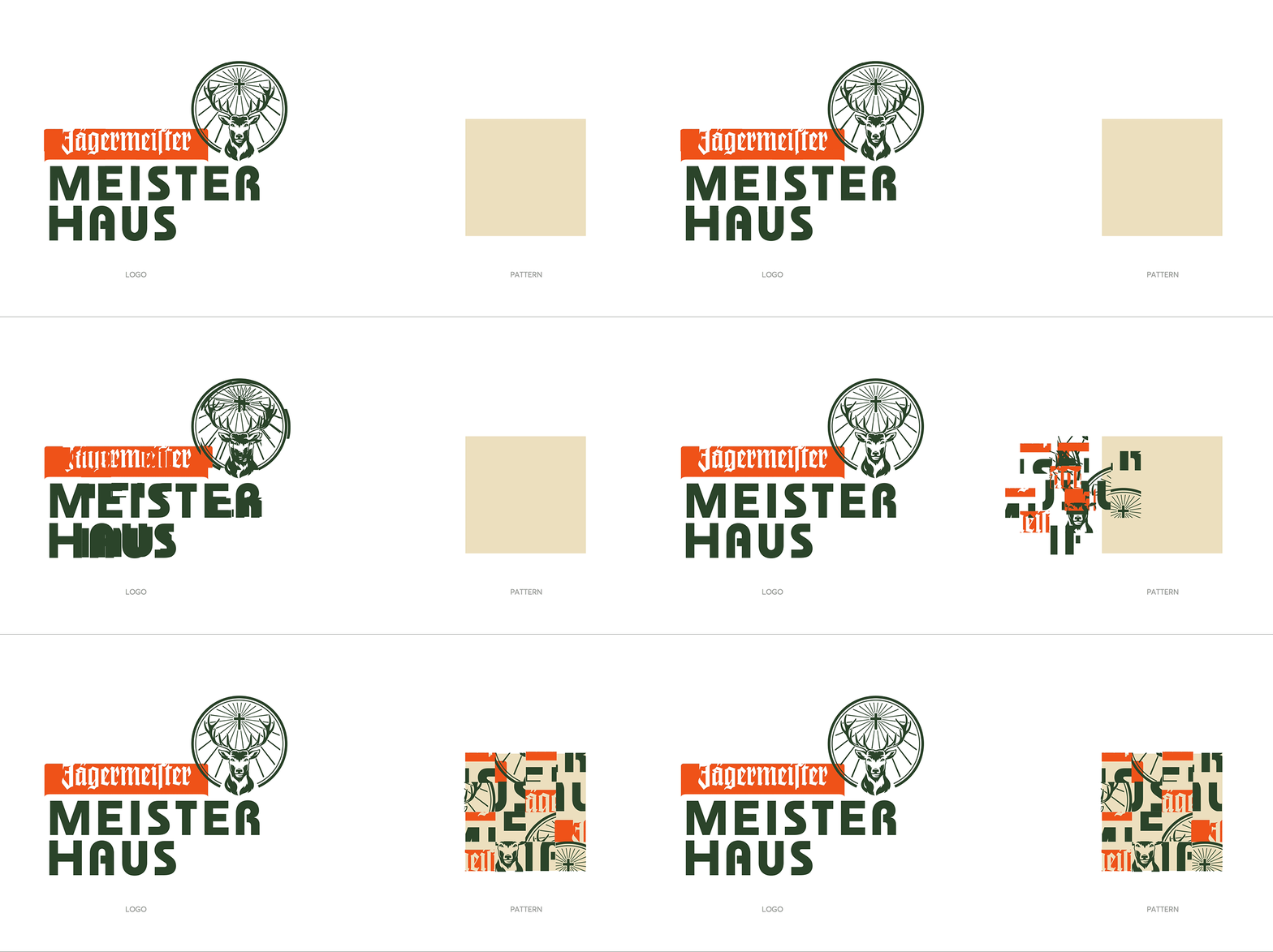
The MeisterHaus logo was inspired by the Bauhaus geometric style, angled lines and bold text.
The brand identity also echoes the limited colour palette from the same movement.

To create a supporting graphic element, the logo was split into a grid and then shuffled to create a unique pattern. Paired together with various colours of the logo, it would go on to form a unique element that can be used for all media


